
Bowie Tonight
***
Album Cover Artist Portfolio:
Mick Haggerty
by Mike Goldstein,
Curator, AlbumCoverHallofFame.com
July, 2018
Every once in a while, I get to pinch myself with pleasure when I realize that I’ve been given the opportunity to meet and interview many of the talented artists who have created some of the world’s most-iconic album cover images. While, of course, I appreciate most all of the works I’ve featured in the articles I’ve published, there are certain works that, for my own personal reasons, are deeply-affecting to me and, therefore, are often images that I’ve added to my own art collection, so when I get a chance to interview the people who’ve produced these particular images, the whole enterprise takes on additional meaning and emotion for me.
In today’s Album Cover Artist Portfolio article, I’m pleased to highlight the accomplishments of a designer who has created more than a few of my favorite album covers – that being the supremely talented Mick Haggerty. As someone who has created covers for musical acts both here and in the U.K., it also gives me pleasure to learn more about a small number of covers for bands that, for whatever reason, never had much of a following in the U.S. but, as you’ll see, some of those images will impress you as much (or more) than some of his better-known covers. Great art is great art, no matter whether you’re just seeing it for the first time or appreciating it again for the hundredth time, don’t you agree?
At the end of this review, you’ll also be able to read Mick’s opinions about the current “state of the art” of the visual aspects of the music business, including examples of talent he’s impressed with and how he feels about the protection of intellectual property in the age of digital distribution. And so, without any further delay, please enjoy a selection of works from the portfolio of Mick Haggerty, along with some running commentary provided by the designer himself.
David Bowie – Tonight, 1984
Developing a “style” or trademark technique has never interested me much and I tried, when possible, to change it up on every job. When I

Collage – Gamma 1 and Yellow Magic Orch’s Solid State Survivor
started doing music “videos” in the ’80s – which were not shot on video at the time, but on 16 mm film – and was introduced to the techniques of special effect compositing, my curiosity was tweaked and so I set to build my own studio system. Up to this point, all composited photographs were made by cutting and pasting photo prints and then re-shooting the artwork (like you’ll see on the cover for the Go-Go’s Vacation*). Experimenting with multiple layers or changing exposures or adding effects was virtually impossible, but by exposing photographic images backlit, using mattes, onto a single large format photo negative as they did in movies, the graphic possibilities seemed wide open. When David Bowie called about doing “Tonight”, he was interested in making a very heroic and exotic image. He mentioned The “Green Lady” by Tretchikoff and talked about The Knights Templar. I shot a few reference Polaroids of him in his room at The Carlyle Hotel, from which I did the cover portrait drawing and then, dragging a large format camera around New York, assembled a library of images including flowers, time lapse exposures of traffic, and smeared paint. After about a month of work, I emerged from my studio with a single 8″ x 10″ color transparency. All I had done in fact was invent an analog version of Adobe Photoshop, producing an image which now might take me an hour, but back then it was much more laborious and hit and miss, but much more exciting. In this portfolio, using the same method, I also made the “Gamma 1” cover along with the piece which gives me the most pleasure – a cover for a special single release in Japan for Yellow Magic Orchestra’s “Solid State Survivor”.

The Move – The Best of The Move, 1974
This is an early piece from the mid ’70s for A&M, and I include it not only because I think it still stands up, but also as a reminder of how 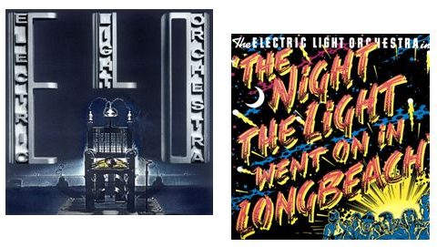 weird it can get making art for musicians. It was made for a “best of” album for the British band “The Move”. I have always been interested in very saturated, busy images and especially ways to dynamically show movement, so here I really pulled out all the stops. I’m not sure what Roy Wood had been smoking that day, but he took one look and declared “Sorry, it doesn’t have enough impact”, so it was never used. Instead, they settled for a drawing of a removal van! Strangely, I went on to do two more covers for him with the Electric Light Orchestra.
Jellyfish – Bellybutton, 1990
I did this cover for my friend Steve Samioff, who was the art director at Charisma. I can’t say for sure where the idea of a naked girl and toothpaste came from, but I must highly recommend that you not try this at home. The photo shoot went well, and the model was a pleasure to work with, even after spending the better part of a long day naked, covered only in various patterns and colors of toothpaste. It was the next day we got the call from the emergency room, where it seems the menthol had left her with some very painful and scary lesions which, luckily, went away after a couple of days.

Jellyfish – Spilt Milk, 1993
The advice to “never work with animals or children” was proven to be true again. I can only tell you that those tears are real.

Jerry Lee Lewis – Jerry Lee Lewis, 1979
Being a long-time admirer of Mr. Lewis, I told the record company that I needed photo references to work from for the cover and I pressed them hard to let me shoot the recording session, and they agreed. I had been kneeling at the end of his piano for a couple of takes when he slammed down the lid and, with the back of his fist, launches a shot glass of bourbon flying over my head to smash against the wall. The session ended, apologies were exchanged, and I got my cover.
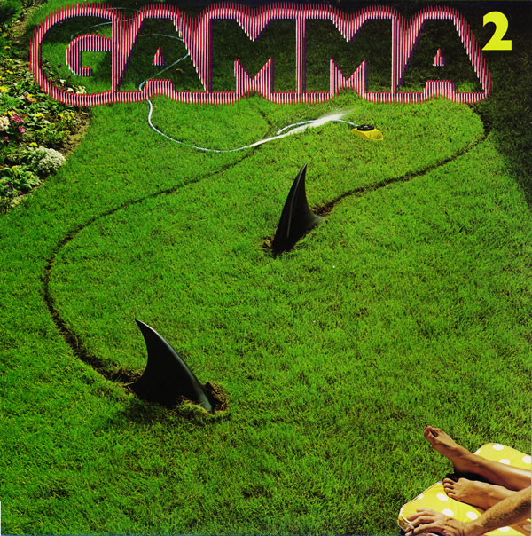
Gamma – 2, 1980
Ronnie Montrose was a dream to work with and, after showing him sketches, we had fins built, lawns cut, a model chosen, and photos taken to the delight of every one at Elektra Records. That was until the Rolling Stones decided to put up a billboard on Sunset Blvd showing a lady bound and beaten, to advertise Black and Blue. Within hours, as The Stones I’m sure anticipated, there followed demonstrations that blocked the street and closed down nearby record stores. I received a very panicked phone call from the record company saying the cover can’t run because it also “glorifies violence against women”. I pointed out that those were not real sharks and, in the end, we agreed that I reshoot the image with a man and a woman lying on the sun bed. Well, there is just no room for a man and a woman to lie sensibly side by side on a sun bed so, instead, I stripped in a man’s arm. As it turns out, I liked it more that way because the cigarette just adds just a hint of the post-coital.

Orchestral Maneuvers in The Dark – The Pacific Age, 1986
I was taking very long trips down to Baja during this period and making crude block prints, so a lot of this was printed on the road.

Collage of all three OXO covers
(OXO – OXO, 1983)
In England, there’s a brand of much-loved bouillon cubes called Oxo, which gave their name as slang for Cubans, or so I was told, since the band was formed by Cuban-American Ish Ledesma of Foxy fame. Warner Records agreed to do three different color versions of the cover, with the name highlighted in different places. I like this cover a lot. How often do you get to cover something in hugs and kisses and it makes sense?

Jimi Hendrix – Kiss The Sky, 1982
A labor of love. My attempt to make an icon for an icon. Love you, Jimi.

Simple Minds – Alive and Kicking, 1985
Another favorite of mine. It is satisfying to have taken so much out of the type and have it still so legible.

Keith Richards – Main Offender, 1992
At first, Keith sent over a shoot by David LaChapelle that he wanted to use. It was a perfectly nice fashion shoot, but nothing “Main Offender” about it, unless you took offense at the inclusion of too many silk scarves. I convinced Keith to let us have a few minutes at the recording studio and primed Dewey Nicks to just take a really confrontational and tough portrait. The lad did well. I didn’t do the type on this one, as it was done perfectly by Tom Dolan.

Supertramp – Breakfast in America, 1979
Just when I thought everything that could be said about this had already been said, a friend alerted me to some paranoid blog, certainly manned by some motley collection of conspiracy theorists with tin foil hats, who helpfully pointed out that, although I made this image more than twenty years beforehand, when reversed, it clearly shows the number “9 11” behind the Twin Towers, and forwards it reads “UP”! Damning evidence, for sure. I’m on a list somewhere…..

Public Image Ltd – 9, 1989
This was my first image made on a computer. It was a huge noisy Swedish machine I think, that came with a technician and an operator, who was very hard to work with. Again it took days to make an image now so simple for Photoshop. Looking at it now I really love the crudeness. I also loved working with Mr. Lydon. I shot three music videos for him and he was a real inspiration.

Richard Thompson – Mirror Blue, 1994
My idea for this cover was to create a “mass produced” plaster statuette of Richard as though he was Elvis or Marilyn. The idea only works because Richard most definitely isn’t Elvis or Marilyn, so presenting the idea was a little tricky, but Richard is one of the funniest fellows you’ll ever meet and just laughed and went for it. We ended up taking the statuettes all over and leaving them at swap meets, thrift shops and on people’s lawns. When I reminded him that the very first cover I ever did back in England was for Fairport Convention, Richards seminal folk band, he told me he didn’t care for it much.

Maria Callas: Tosca
This is pure fantasy. Over the years I’ve made covers that would never really exist, just for my own pleasure. I became fascinated with Los Angeles Chicano prison art. Men behind bars making very elaborate and beautiful drawings, letters really, declaring obsessively love for their missing wives or girl friends, or perhaps just their ideal woman. I looked around for a project at which to try my hand. The iconic stature of Maria Callas paired with the melodrama and treachery of Puccini’s Tosca seemed perfect somehow.

Go-Gos Vacation
* Read my complete interview with Mick Haggerty about his work on the cover for The Go-Go’s 1982 hit record Vacation – http://rockpopgallery.typepad.com/rockpop_gallery_news/2007/09/cover-story-the.html
In the interview, Mick describes his pitch to the record label as an attempt to get them to see the work he’d produce as the first step in a true multi-media campaign. As he states – “Record companies around this time had only just realized that artwork and image actually affected sales, and I exploited that by presenting this image not as just an isolated cover but as a concept which could work in all media – video, press, merchandise, etc. Of course, this meant more fun and work for me, but it also pushed the promotional possibilities for the band and, if it all worked, we would all do well.” It’s a fascinating story and one I know you’ll enjoy reading.
***
Q&A with Mick Haggerty –
Mike Goldstein, AlbumCoverHallofFame.com – Mick, thanks so much for taking us through those highlights from your portfolio – it’s really an impressive and wide-ranging collection. Switching gears a bit, I’d like to ask you a few general questions about the scope of design/illustration work and talent we’re seeing in today’s music business, so let me start off asking you what your feelings are about album artwork-related design and photography these days? Are there any musical acts, labels, art directors, etc. that you think are keeping the field alive or important? Do you think album art matters anymore?
Mick Haggerty – I see many images that are wonderful. Recently, FKA Twigs has established herself as a visual Goddess and the cover for the latest record by Elisa Ambrogio I liked a lot as well. I also think that the Aphex Twin made a very nice update of the much loved XTC Go2 cover by originally done by Hipgnosis. Just to name a few.
Editor’s note – the last record Mick referenced – Aphex Twin’s Syro – was packaged in a cover done by the design studio known as Designer’s Republic and includes a listing of the details of what it cost to produce and promote the record, with the CD and LP versions highlighting the different costs to produce for each medium.
Mike G – Yes, a great example of an “early influencer” driving new talent to new levels of creativity. So, now let me ask you – do you think that album cover art help us document modern human history? Personally, it is my belief that, in many ways, iconic album cover art has had a noticeable effect on Pop Culture. What’s your take on this – is the imagery and music providing the direction, or is it reflecting the culture, or ??
Mick H – For a few decades in the our recent analog past, due to the vertical structure of media then, we all watched as a few people made sounds and visuals that were entirely new. As with all pioneers, they rushed to claim untrodden ground. Now it often feels that, with our horizontal structured digital media, we are watching that ground trampled and covered with all manner of shiny new structures and animated junk. I live in LA and it’s pretty hard standing in front of a Walmart while trying to remember the Tongva tribe, the original Native-American people who lived there in just the recent past.
Mike G – Yes, another stunning example of promises made and not delivered on all while “progress” wipes out our history. This sad state of affairs of course leads me to my final question. While doing the research for my book and for some of the bios featured on the ACHOF site, I found examples of something that made me want to work harder to make sure that credits are given where due – those being several incidents over the years where an artist’s work had been used (and, on occasion, abused) by labels, print publishers and/or other artists without permission or without giving proper credit for the work being used. It seems that, in an age where people seem to find it permissible to “borrow” – it sounds so much better than “steal” or “plagiarize” – an artist’s/writer’s/photographer’s work to help them promote and sell their own products, folks that create original art have been forced to police the media and the Internet to do what they can to either stop this unauthorized use or, at least, receive credit for the work they’ve done. Have you been victimized in this way, and do you think that there’s anything that can or should be done about it, or do you simply chalk it up to being one of the costs of doing business these days?
Mick H – As a lifelong “appropriator” and thief, I don’t really care. The skill is to visually cover your tracks so as to obscure your influences; in fact, that’s what commercial design is really all about. We all grow up standing on the shoulders of our antecedents. If you steal and lack the artistry or class to hide your crimes, then off with your head!

Haggerty with Jane & Kathy from Go-Gos
***
About the artist, Mick Haggerty –
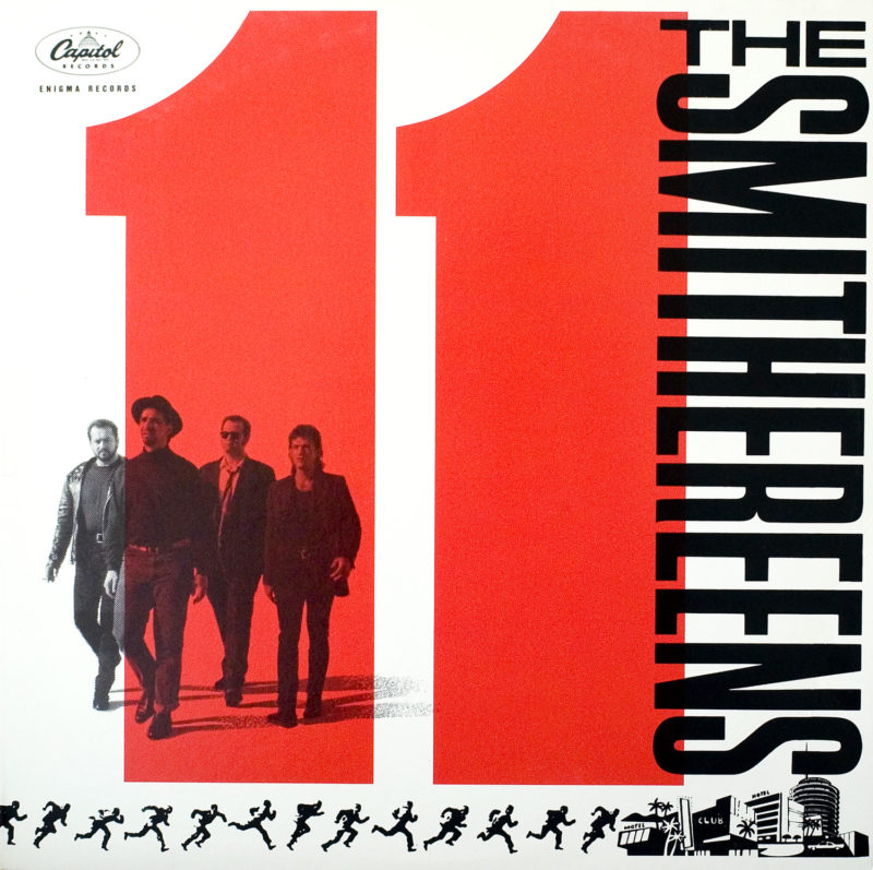
Mick Haggerty – Notable album cover work examples – David Bowie – Let’s Dance, Never Let Me Down and Tonight, The Police – Ghost In The Machine, OMD – The Pacific Age and Supertramp – Breakfast In America; ELO – Face the Music, The Goo Goo Dolls – Gutterflower, The Smithereens – 11 and Stevie Winwood – Roll With It
Born and educated in England, since 1973 he has lived and worked in Los Angeles. As a freelancer, as well as in his roles as the Art Director for Virgin and Warner Bros. Records, he has put together a hugely impressive list of accomplishments, developing memorable designs and videos for a wide variety of musical artists. He has also influenced many of today’s best new designers in his role as teacher and Chair of the Design Department at the Otis/Parsons School of Art & Design in the LA area. Mick humbly notes that “that making images for music offered a working class kid from the suburbs of London an amazing escape route, and I jumped at it.”
In 1979, Mr. Haggerty won the Grammy Award for “Best Album Package” along with the late Mike Doud, as the art director for Supertramp’s Breakfast in America. Again in 1983, Haggerty, (along with Ginger Canzoneri – the GO-GO’s manager) was again nominated for a Grammy Award for “Best Album Package” for The Go-Go’s Vacation. Other nominations include covers for The Pointer Sisters Steppin’ and Glassjaw’s Worship and Tribute.

Collage – Steppin & Glassjaw
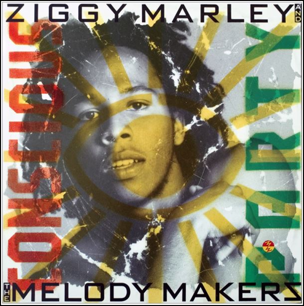
He’s also designed covers for OMD, PiL, Simple Minds, Richard Thompson, Roxy Music, Jimi Hendrix, Jerry Lee Lewis, Keith Richards, Roy Orbison, Jellyfish, Ziggy Marley, Hall & Oates and, more recently, Josh Groban, Disturbed, and Michael Buble.’
As a graphic designer now turned full-time fine artist, Mick now spends most
 of his time shuttling with his family between his studios in South Africa and Southern California and, when not working on design projects, still spends every day he has in his studio. “Pushing paint around for its own sake is the most pure form of joy I have found”, he says. “I’m not working commercially any more, but as I stay the original impetus to get up and make art is a constant. Does anyone ‘retire’ anymore?”
He continues – “Since I was a kid I always got up each day and looked for some way to make art, so while making commercial art for music was an amazing gift for a while, I still get up and make art just the same – books, prints, drawings, photographs and just hours of painting and loving it.”
To see more of Mick Haggerty’s work, please visit his website at http://www.mickhaggerty.com
All images featured in this story are Copyright 1974 – 2018 Mick Haggerty – All rights reserved – and are used by the artist’s permission. Except as noted, all other text Copyright 2014 – 2018 – Mike Goldstein, AlbumCoverHallofFame.com (www.albumcoverhalloffame.com) & RockPoP Productions – All rights reserved.
Recent Comments